Adaptive Design
Rather than a one-size-fits-all approach, content and design elements are pre-set to adapt to the recognized device, ensuring an optimized user experience.
Part of Macu Studio's Webflow web design services. Available as a project or inside Webflow Care. See pricing.

Want adaptive design handled every month rather than once? The Design Partner subscription covers Webflow, Framer and brand design, and existing sites stay current on a retainer. See pricing.
What is adaptive design?
Adaptive design in digital marketing is a method that allows for the creation of multiple fixed layout sizes to fit various screen sizes, typically for major device types like desktops, tablets, and mobile phones. Rather than a one-size-fits-all approach, content and design elements are pre-set to adapt to the recognized device, ensuring an optimized user experience. This technique acknowledges the diverse array of devices consumers use and adjusts the interface to meet the specific dimensions and capacities of those devices.
Trusted by






What are the benefits of adaptive design?
Adaptive design offers several key benefits in enhancing user experience and ensuring the effectiveness of digital content across different devices:
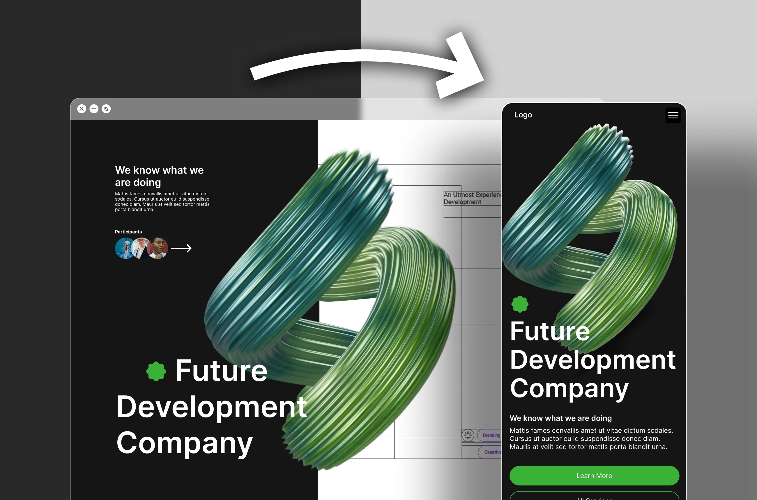
Improved User Experience
By tailoring layouts to specific devices, adaptive design ensures that each user has an optimal viewing experience, which can lead to increased user satisfaction and engagement.
Enhanced Readability and Navigation
Content is easier to read and navigate when it’s designed for the user’s specific device, which can reduce bounce rates and improve the overall performance of a website or application.
Better Load Times
Adaptive design can lead to faster load times since the server sends only the necessary assets for the user's particular device, rather than loading a full responsive design.
SEO Benefits
Google and other search engines prioritize mobile-friendly websites in their rankings. Adaptive design can contribute to better SEO performance by providing device-appropriate versions of content.
Increased Conversion Rates
An interface that works well regardless of the device can lead to higher conversion rates as users are less likely to abandon a site due to poor experience.
Future Scalability
As new devices hit the market, adaptive design allows for the creation of additional layouts to cater to those new screen sizes and resolutions, ensuring longevity and adaptability of the digital content.
Why choose Macu for adaptive design
Choosing macu.studio for your adaptive design services ensures that your digital presence aligns with the cutting-edge standards of current web design. Our expert team leverages the innovative Tilebit.io library to deliver a tailored experience for every user, enhancing engagement and interaction regardless of the device. Macu.studio's commitment to meticulous, user-centric design results in a seamless and responsive interface that engages customers and drives business success. Trust macu.studio to provide a resilient and agile digital platform that evolves with technological advancements and user expectations.
Adaptive Design
Process
Establish Your Layout Grid

Create Responsive Components
Implement Constraints
Use Variants for Different Screen Sizes
Prototype and Test
Recent Case Studies

Tools We Use














How To Get started
Tell us about your project
Get a free video review with problem areas to focus on
Agree the scope and get started
A studio without the fluff
Intentionally Small
Design & Dev is our jam
We aim on transformation (& don't miss)
Adaptive Design
FAQ's
What is the difference between responsive and adaptive?
When would I choose adaptive over responsive?
Does Webflow support this properly?
Does it cost more than a standard build?
Which approach will you recommend for my site?
Who actually does the work at Macu Studio?
How much does a Webflow project with Macu cost?
Do you also cover design, development and SEO?

"In Arnau, I trust! Supreme talent, sensible, professional. The whole package.”

"Arnau's content is clear and concise, I can always count on him to deliver quality education"