Responsive Design
Responsive design revolutionized web development by introducing a unified approach to create seamless experiences.
Part of Macu Studio's Webflow web design services. Available as a project or inside Webflow Care. See pricing.

Want responsive design handled every month rather than once? The Design Partner subscription covers Webflow, Framer and brand design, and existing sites stay current on a retainer. See pricing.
What is responsive design?
In the world of web development, responsive design is a fundamental concept that ensures a website's layout adapts gracefully to various screen sizes and devices. It's an approach that suggests design and development should respond to the user's behavior and environment based on screen size, platform, and orientation. This practice consists of a mix of flexible grids and layouts, images, and an intelligent use of CSS media queries. As the user switches from their laptop to iPad, the website should automatically switch to accommodate for resolution, image size, and scripting abilities. In essence, the website should have the technology to automatically respond to the user’s preferences. This eliminates the need for a different design and development phase for each new gadget on the market.
Trusted by






What are the benefits of responsive design?
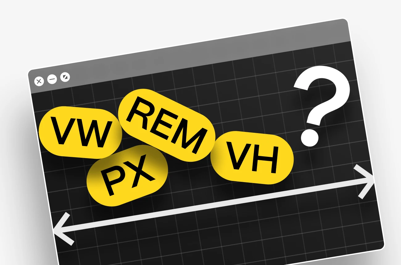
Responsive design offers several benefits for a website's success
Enhanced user experience
Ensures comfortable content access on any device, leading to increased satisfaction and lower bounce rates.
Favorable search engine rankings
Responsive websites are preferred by search engines like Google, resulting in higher search rankings.
Cost efficiency
Maintaining one adaptive website is more economical than creating separate sites for desktops, tablets, and smartphones.
Future-proof
Responsive design ensures compatibility with current devices and adaptability to future screen sizes and technologies.
Why choose Macu for responsive design
Choosing macu.studio for your responsive design needs ensures that you have a partner adept at creating digital experiences tailored for the modern web landscape. I specialize in crafting visually appealing, user-centric designs that prioritize not only functionality but also accessibility across every device and platform. At macu.studio, we harness the latest technologies and follow industry best practices to deliver a product that not only meets but exceeds your expectations. Our commitment to responsive design translates into websites that are fast, flexible, and future-ready, helping to keep you ahead of the competition while also improving search engine visibility and user engagement. With our expertise, your project will be more than just a website; it will be an adaptive digital experience that grows with your audience and the ever-evolving tech ecosystem.
Responsive Design
Process
Discovery and Strategy

Wireframing and Prototyping
Design and Development
Testing
Launch and Optimization
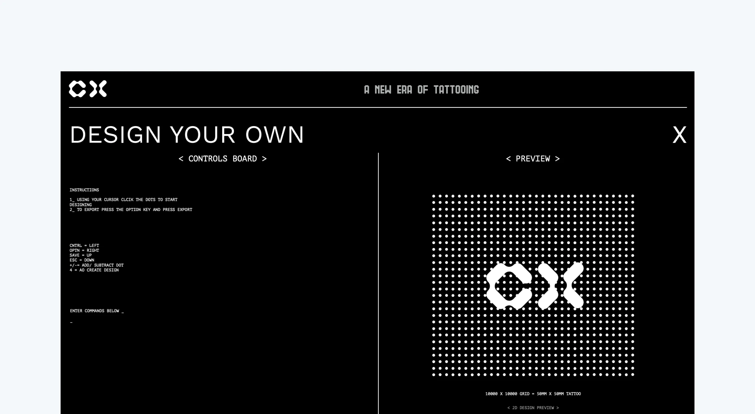
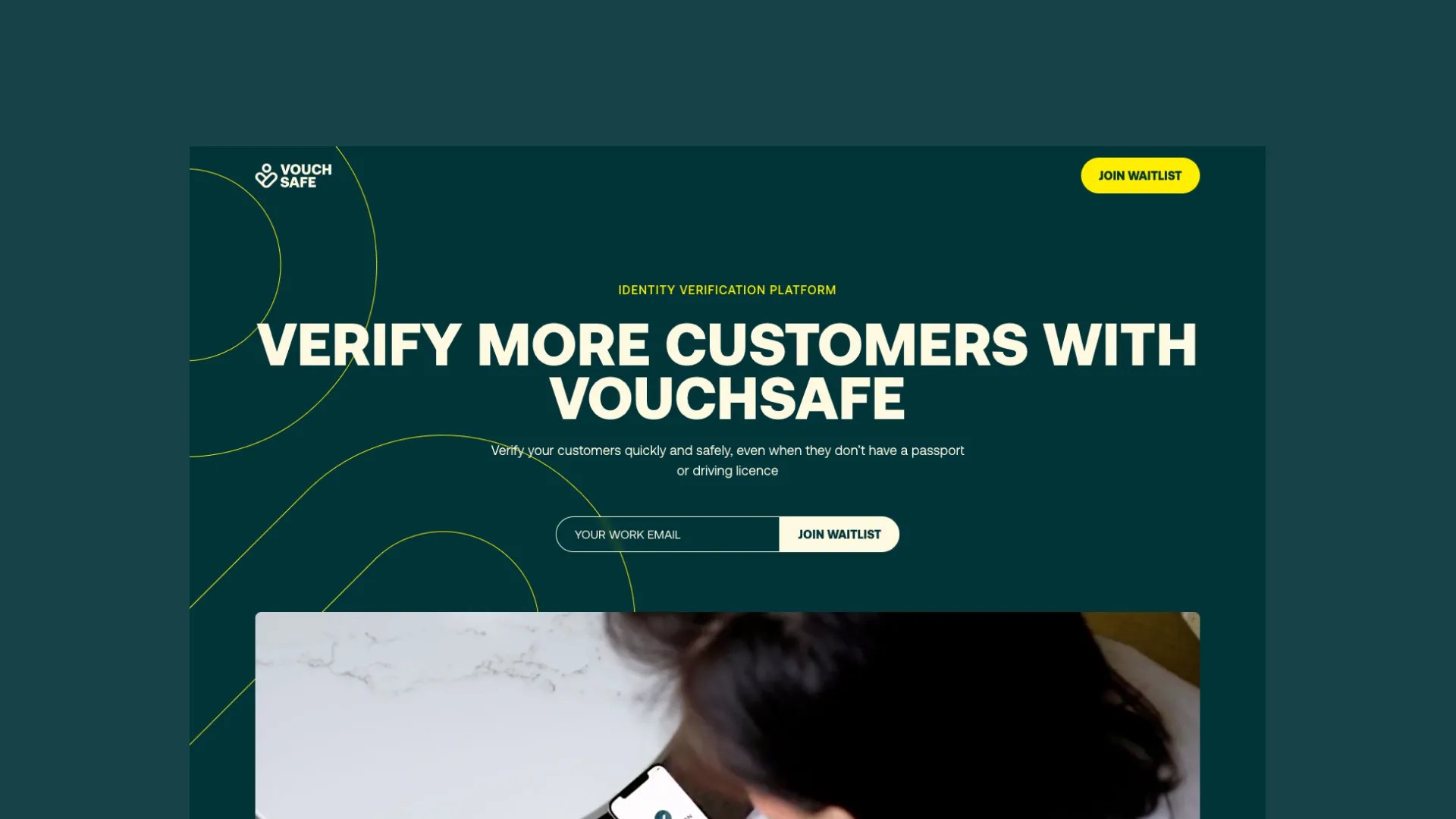
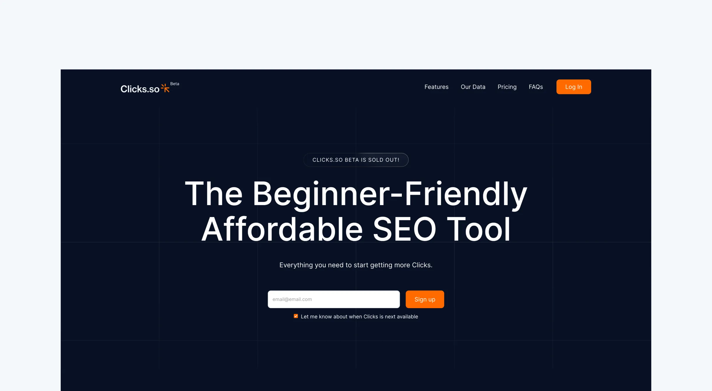
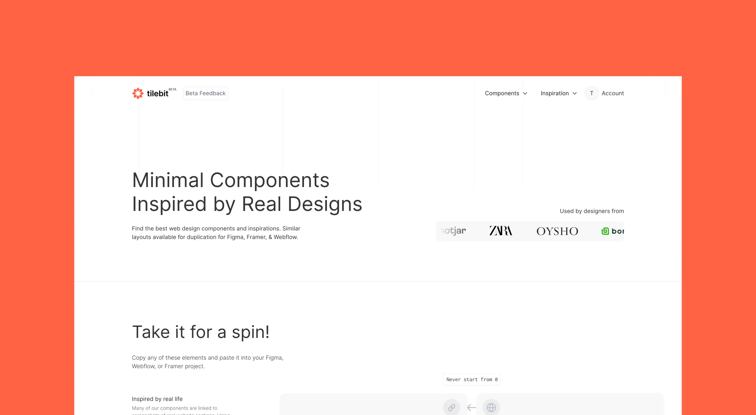
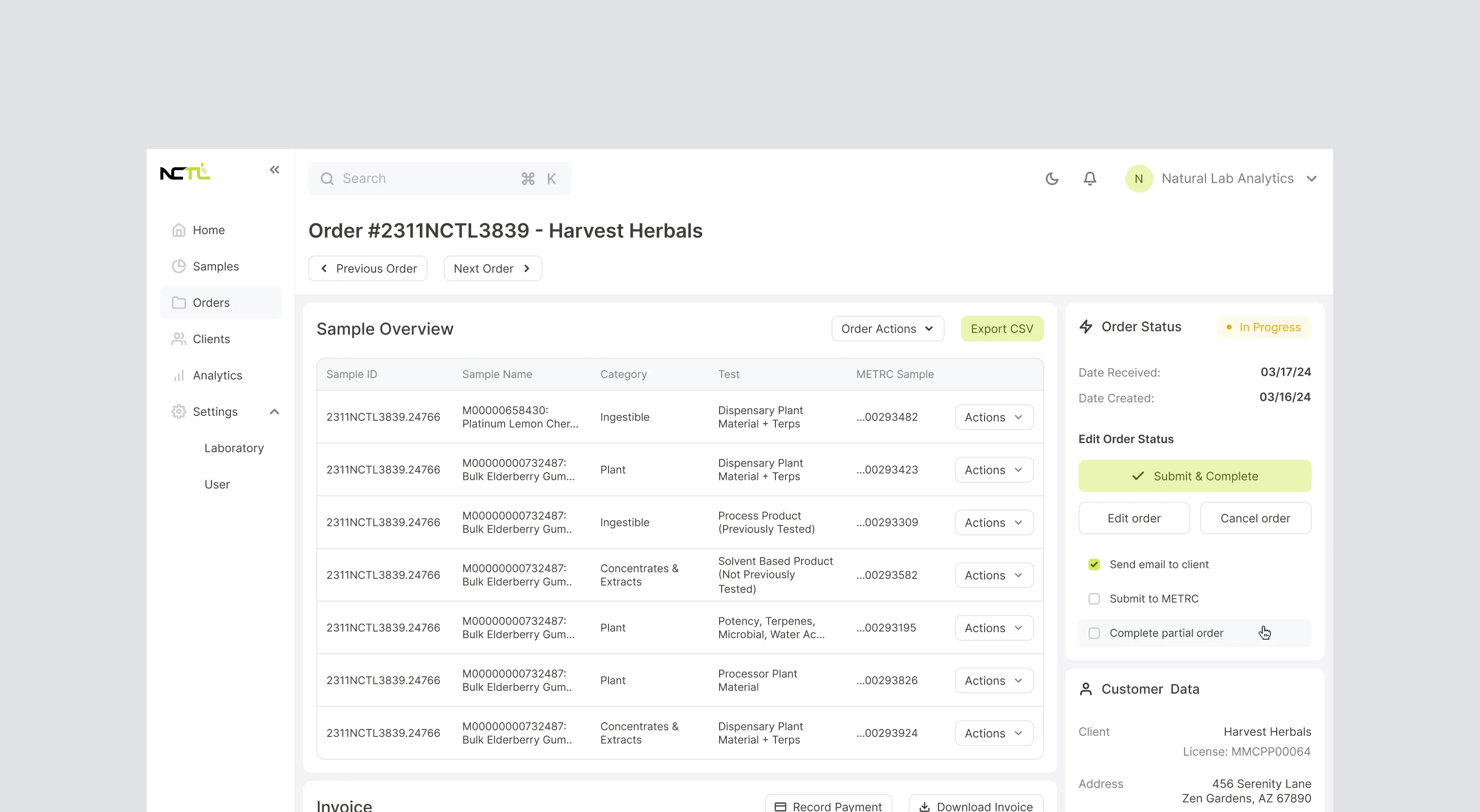
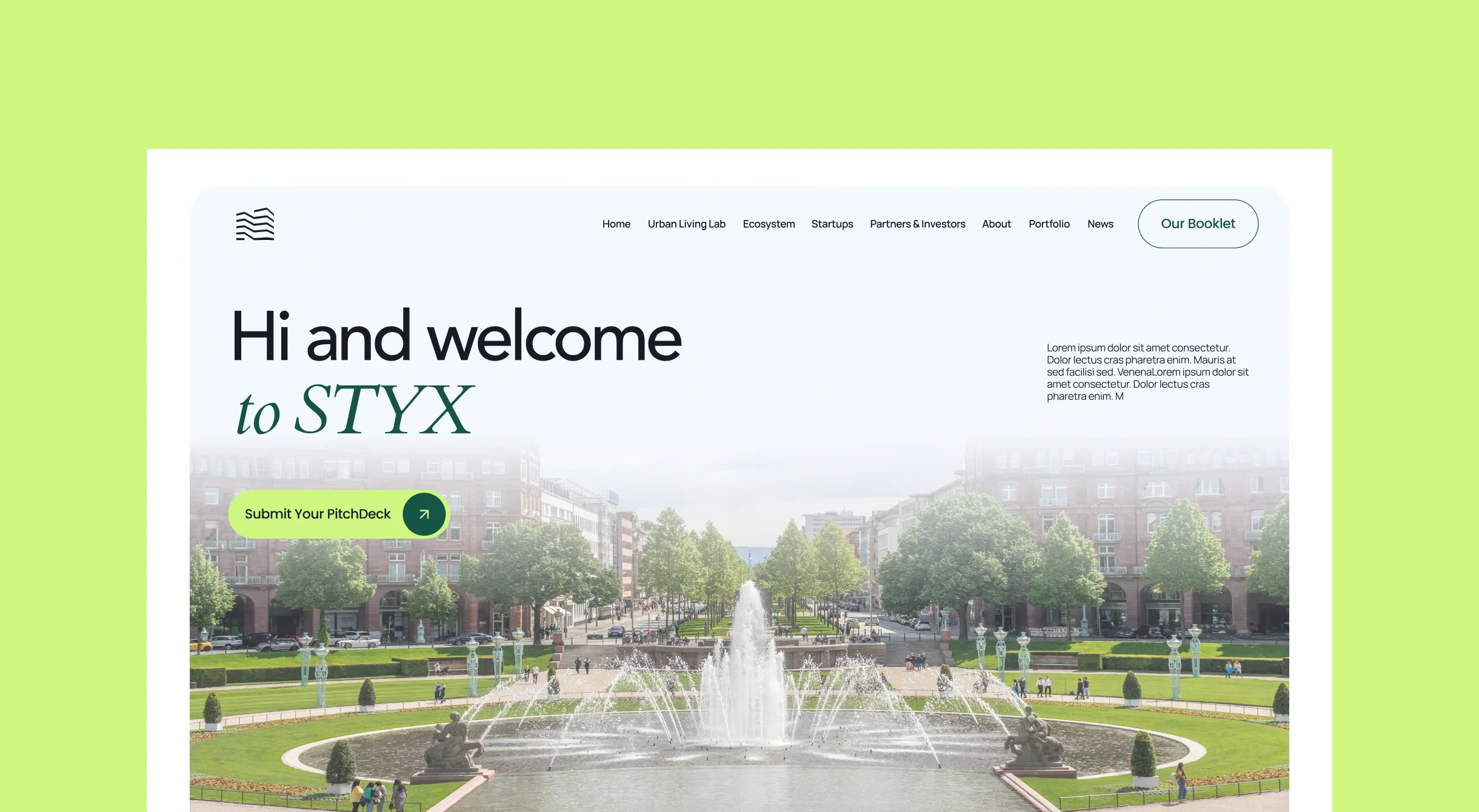
Recent Case Studies
Tools We Use














How To Get started
Tell us about your project
Get a free video review with problem areas to focus on
Agree the scope and get started
A studio without the fluff
Intentionally Small
Design & Dev is our jam
We aim on transformation (& don't miss)
Responsive Design
FAQ's
Is responsive design still a thing?
What should I pay a web designer for this?
How is this different from adaptive design?
Which devices do you actually test on?
Can you fix a site that breaks on mobile?
Who actually does the work at Macu Studio?
How much does a Webflow project with Macu cost?
Do you also cover design, development and SEO?

"In Arnau, I trust! Supreme talent, sensible, professional. The whole package.”

"Arnau's content is clear and concise, I can always count on him to deliver quality education"