


Strategic spacing amplifies a website's imagery and copy, making content legible and engaging. The foundation is a four-point grid system, sometimes extended to eight points, which keeps padding and element placement consistent and scalable across screen sizes. Stripe's hero header is cited as the benchmark for elegant spacing. Applying the same consistent spacing across hero sections, feature columns, and footers creates clear hierarchy, visual rhythm, and a coherent, unified design.
Part of our guide: Design Skills & Career
Want a senior designer on tap instead? The Design Partner subscription covers Figma, Webflow and Framer work for a flat monthly fee. See pricing.
At the heart of every standout website are two fundamental elements: impactful imagery and compelling copy. These elements serve as the core communication channels of a website, engaging users visually and verbally. Yet, the true effectiveness of these elements is significantly amplified by the strategic use of spacing. Properly implemented spacing not just enhances visibility but ensures the content is legible and engaging to the audience.
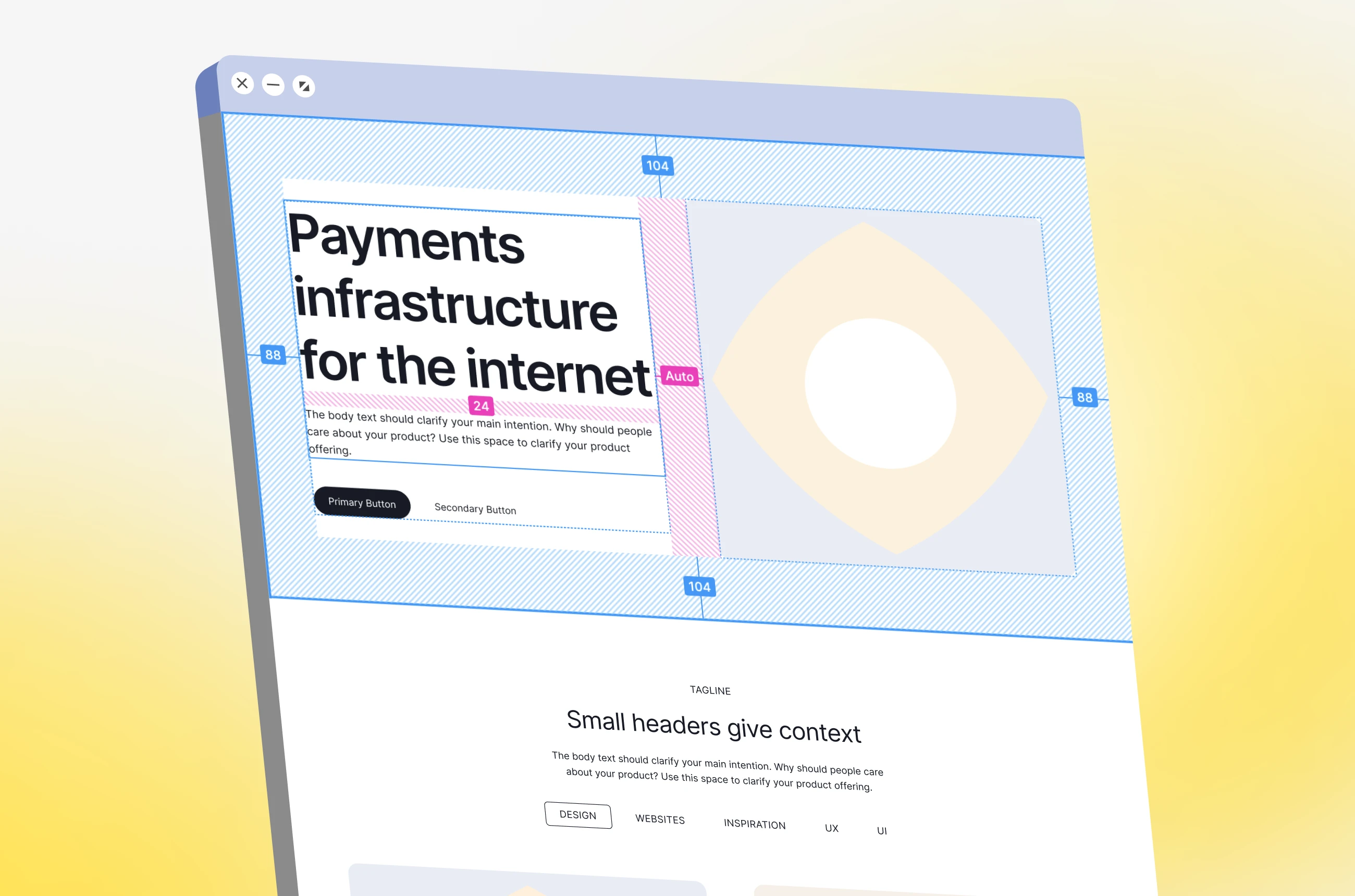
Stripe's website exemplifies the pinnacle of design elegance, where spacing is meticulously applied to achieve an aesthetically pleasing layout. By analyzing the Stripe hero header alongside a template from a wireframing kit, we can uncover the secrets behind such sophisticated design choices. This comparison highlights the importance of consistent padding and strategic placement of images and text, showcasing how spacing is pivotal in creating a visually harmonious interface.
The foundation of such structured designs lies in the utilization of grid systems, specifically, the four-point grid system, which is sometimes extended to eight points. These grid systems facilitate scalable and logical arrangements of content, ensuring consistency across various screen sizes. The meticulous application of these grids guides the spacing between elements, enabling designers to create balanced and visually appealing interfaces.
Applying these spacing concepts involves fine-tuning various design elements, such as text size and image placement, to closely replicate the desired aesthetic. This process requires precise adjustments to element dimensions and alignments, adhering to the grid system to achieve the look and feel of the target design. The goal is to meticulously craft the layout to mirror the exemplary design, paying close attention to every detail, including the backdrop and spacing between content blocks.
The application of spacing principles extends beyond just the hero header to encompass the entire website layout, including feature sections and footers. Maintaining consistent alignment and spacing throughout these sections is crucial for reinforcing the visual narrative of the website. This consistency ensures that the design feels integrated and coherent, with each element meticulously aligned following the established grid system.
Effective spacing is about more than just separating content; it's about creating a clear hierarchy and visual rhythm within the design. By thoughtfully adjusting spacing between content blocks, designers can significantly influence the overall aesthetic and user experience of the website. Whether distinguishing between different types of content or adjusting spacing within feature columns, the strategic use of spacing can have a profound impact on the design.
Mastering the art of spacing is crucial for creating web designs that are not only visually appealing but functionally superior. By adhering to structured grid systems and paying close attention to the spacing between and around elements, designers can enhance the user experience, making the content more accessible and engaging. As demonstrated through the Stripe design analysis and practical application in design tools, effective spacing is a critical component of web design, capable of transforming good designs into great ones.