


Figma components are a powerful tool for creating reusable elements in your designs, yet many designers find them challenging to grasp. In this comprehensive guide, we'll walk you through everything you need to know about creating and utilizing Figma components efficiently. By the end of this tutorial, you'll be able to leverage components to streamline your workflow and design with ease.
Figma components are reusable design elements that maintain consistency and let you make global changes at once. Create one by selecting an element and pressing Option + Command + K on Mac, then build variants for states like default, hover, and active. Combine components with Auto Layout for responsive structure, add interactive hover and click states, and organize them using frames, folders, and naming conventions. Test across screen sizes with preview mode and extend workflows with plugins.
Part of our guide: Design Skills & Career
Need Figma work done rather than taught? The Design Partner subscription covers Figma design and Webflow builds for a flat monthly fee.
Before diving into the creation process, let's understand what components are and why they are essential. Components in Figma are reusable elements that can be used across multiple designs. They allow you to maintain consistency, make global changes easily, and speed up your design process.
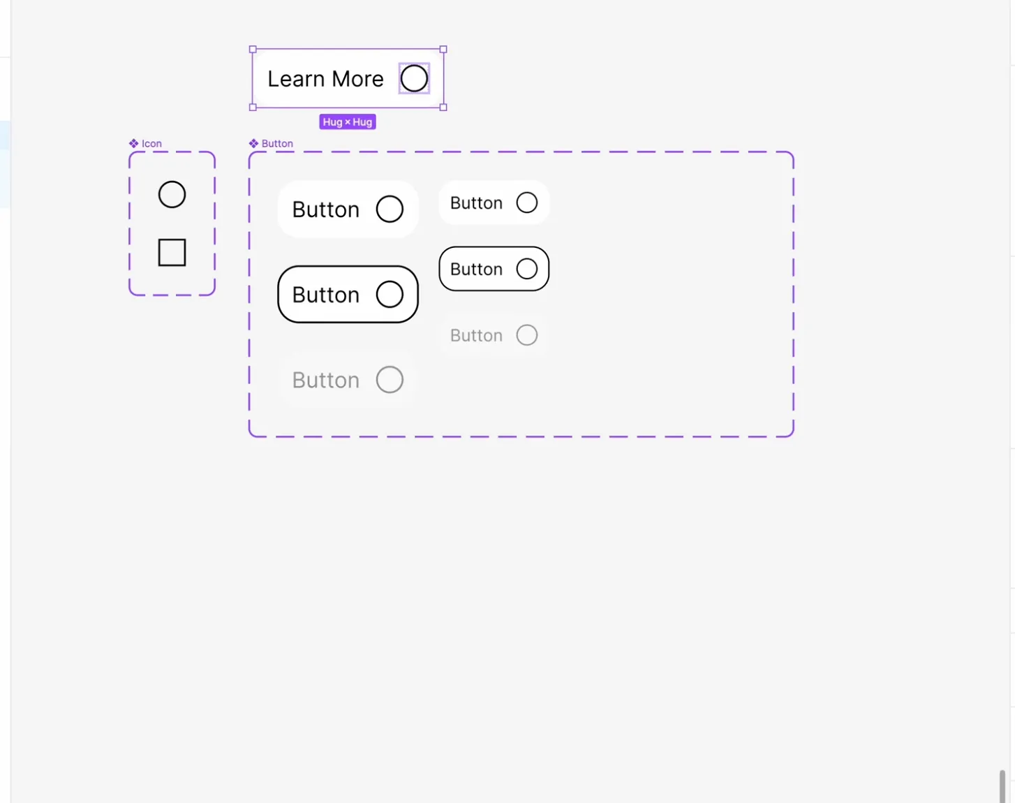
To create a component in Figma, start by selecting the element you want to turn into a component. It could be a button, icon, or any other design element. Once selected, press Option + Command + K (Mac) or use the "Create Component" button. This action converts the selected element into a component.
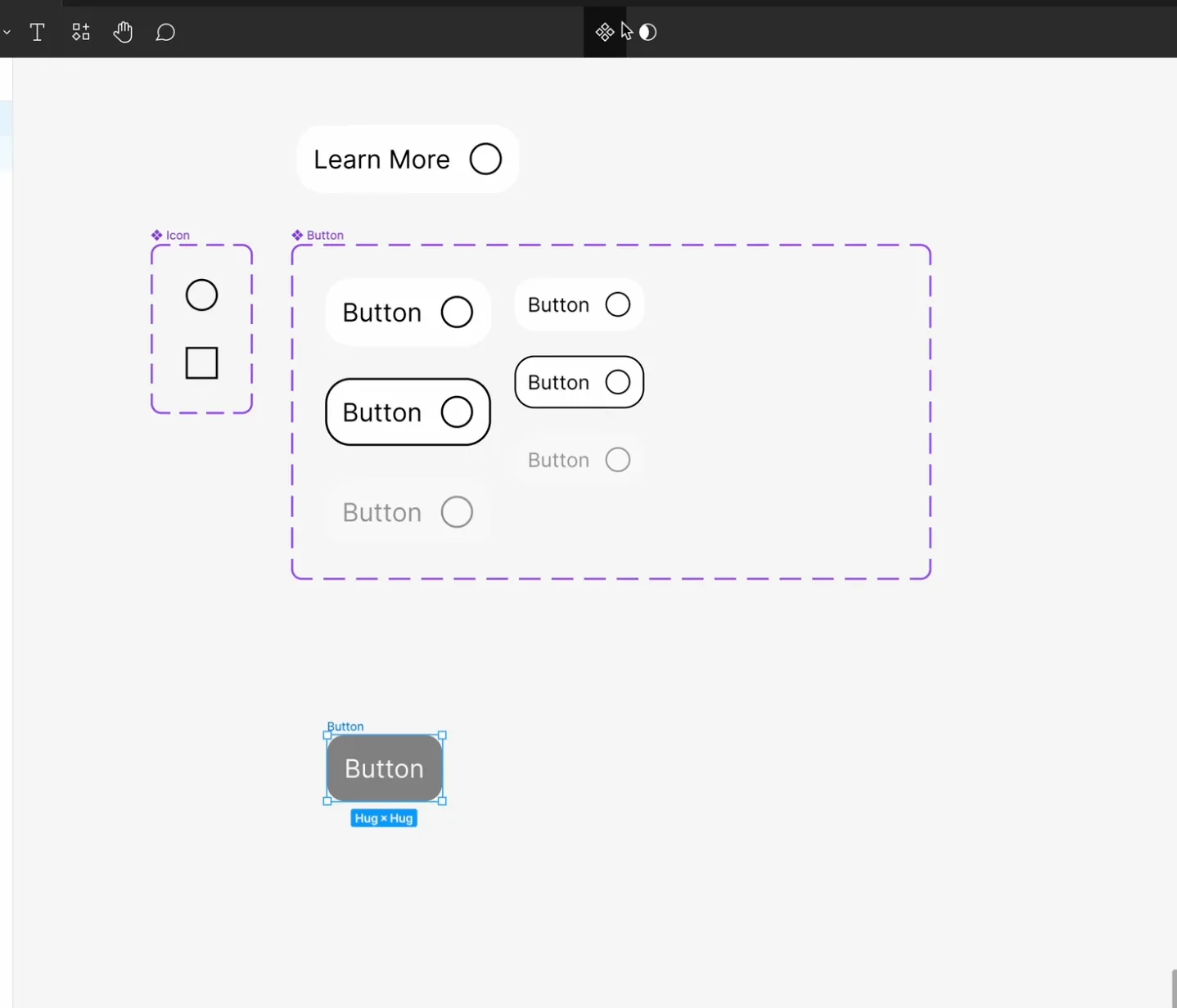
Now that you've created your component, it's time to build variants. Variants are different states or versions of your component. For example, if you're creating a button component, you might want variants for default, hover, and active states. To create variants, click on the "Create Variant" button within the component and define the properties you want to change for each variant.
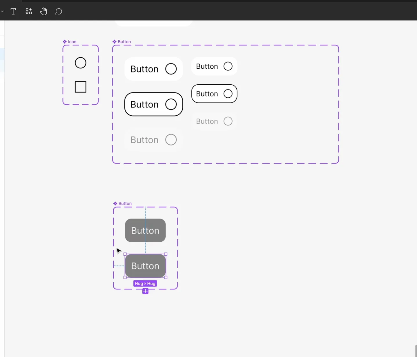
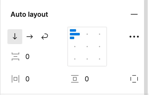
Auto Layout is a powerful feature in Figma that allows you to create responsive designs easily. When working with components, Auto Layout helps maintain the structure and alignment of your variants across different states and sizes.
Components in Figma can also have interactive properties. You can add hover effects, click states, and other interactions to enhance the user experience of your designs. Utilize Figma's interactive features to bring your components to life.
As your design system grows, organizing your components becomes crucial. Create a structured hierarchy for your components using frames, folders, and naming conventions. This ensures easy navigation and management of your design library.
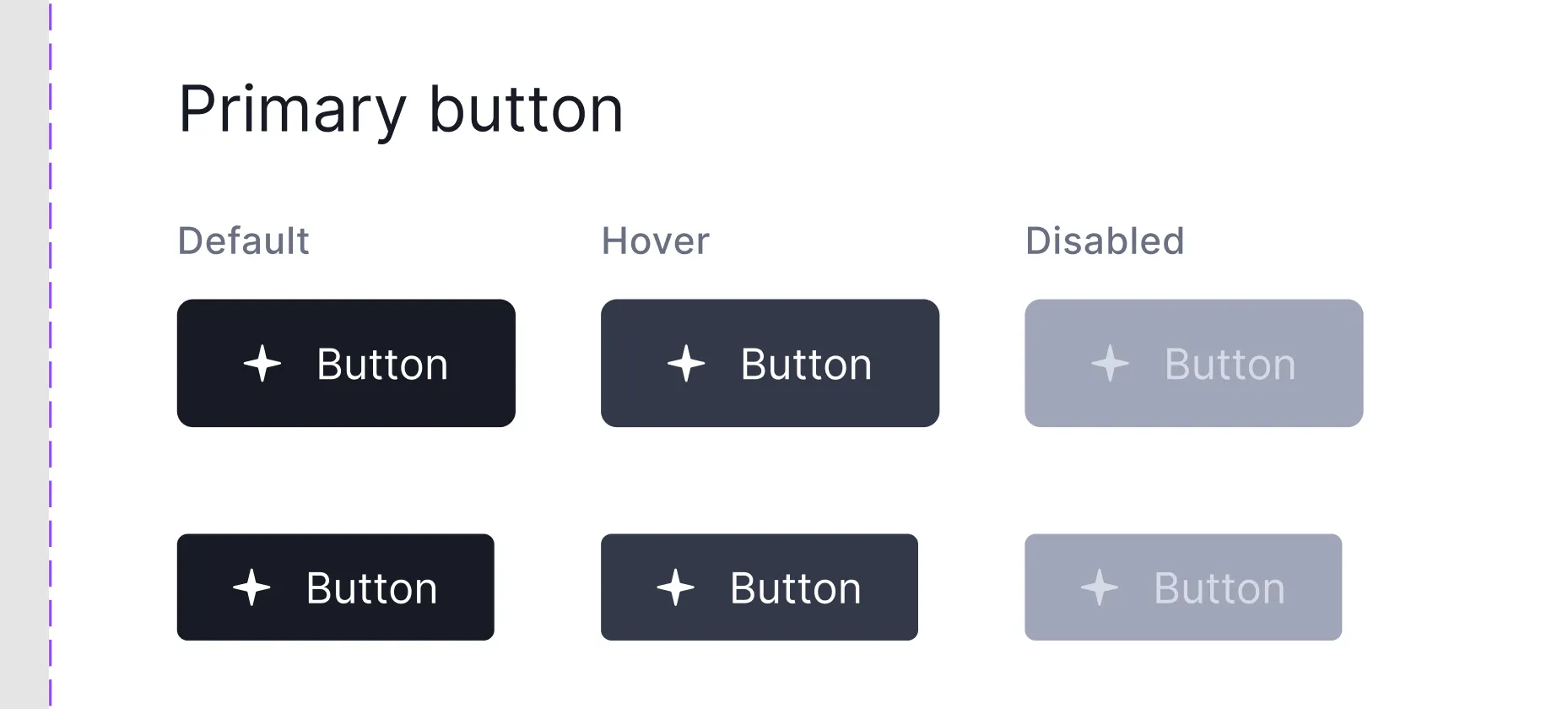
Once you've created your components, it's essential to test them thoroughly across different scenarios and screen sizes. Use Figma's preview mode to simulate user interactions and ensure that your components function as intended. Iterate on your designs based on feedback and usability testing results.
Figma offers a wide range of plugins that can enhance your component workflow. Explore plugins for generating placeholder text, creating custom icons, and more. Incorporating plugins into your workflow can further streamline your design process.
Mastering Figma components is key to becoming a proficient designer in Figma. By following the steps outlined in this guide and practicing regularly, you'll gain the skills and confidence to create versatile and reusable components for your designs. Remember to experiment, iterate, and stay updated with the latest features and best practices in Figma.